
Posted in
3895
2:26 am, July 3, 2019
using a css grid area template
here we can specify areas for the grid. using grid-template-areas.
once the areas are defined we can add the items into each area with grid-area: header in each element
Use grid-area Without Creating an Areas Template
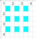
grid-area: horizontal line to start at / vertical line to start at / horizontal line to end at / vertical line to end at;
Here is a quick reference to how the line numbers work in css grid.
HTML
<div class='grid-wrap'>
<div class='c1'>1</div>
<div class='c2'>2</div>
<div class='c3'>3</div>
<div class='c4'>4</div>
<div class='c5'>5</div>
</div>
CSS
.grid-wrap {
display:grid;
grid-template-columns: 33% 33% 33%;
grid-template-rows:50px 50px 50px;
grid-template-areas:
  "header header header"
  "advert content content"
  "footer footer footer";
font-size:22px;
grid-column-gap: 10px;
grid-row-gap: 10px;
grid-gap:10px 10px; /* this is shorthand for the grid-column-gap and grid-row-gap */
}
c1,c2,c3,c4,c5 {}
  .c1{background:LightSkyBlue; grid-area: header }
  .c2{background:LightSalmon; grid-area: advert}
  .c3{background:PaleTurquoise; grid-area: footer}
  .c4{background:LightPink; grid-area: content}
.c5{
background:PaleGreen;
grid-area: 1/1/2/4;
}
1
2
3
4
5
View Statistics
This Week
118
This Month
435
This Year
473
Add Comment
Other Items in css
rotate an element when its hover
rotate an element when its selected
Left Fixed nav with right fluid content
css html vertical center
css cursor types testing
CSS Object Fit for Image fill rather than using background image on a div
flip card animation 3d front and back css html
six box grid css html custom no gap
four box grid css html custom
Kinda Crappy 3D button code
4 box custom grid css layout stack on mobile 1024 lower
use an image in your list items ol ul li
css grid container with 4 auto columns
select something with custom data attribute css
rainbow text background clip with linear gradient
content-visibility and contain-intrinsic-size for page load rendering speed increase
set a css grid to auto to make it stack on mobile
truncate text with line clamp allow a certain number of lines
using the :user-valid CSS pseudo-class
add a button to an existing link using :after css
bouncing loader animation in css
center a box in the middle of the screen
highlight a button with an animation css
add an outline to everything!
hide the first h3 tag on the page with css
center align vertical 2 items in a container flex
simple javascript no library accordion
button zoom effect with expanding background
scroll left animation
using css counter-increment to add numbering to elements
hidden scroll anchor for custom scroll position
ken burns slow image zoom
using a radial gradient for background overlay
change selected color on input elements css
animated duck on footer
using filter grayscale to make an image dark
bootstrap dark mode
twitter icon font awesome
how to bundle css files together using windows or mac
button with separated chevron
vertically align text within a fixed height div using flex
how to view a web page in its printer format
white space break word css
roboto and poppins fonts include quick code
CSS Drawing - Beach Scene
404 Error Page Codepen
right align something in its element
hide the third row in a table with css
how to make a transparent logo white with css
target last item css with :last-of-type
Related Search Terms
Other Categories in Code
alpine js apps c css factorio font awesome images linux quick modals sqlite site bugs site updates slick slider sliders testing windows apps apache api apps asp bat bootstrap bootstrap templates charts cookies core css css filters css grid design elements docker domains emoji fancybox fonts foundation framework gimp git html icons ideas image formatting images javascript javascript functions jquery js linux mac misc modals mysql nginx node php php errors php function php functions php simple html dom pi400 python react regex sections simple_html_dom simplepie php site bugs site documentation slick slider sql sqlite ssh sublime svg svg css templates tools virtual box vscode vue webdev windows windows 11 windows commands wordpress

