Fast & Easy WordPress Mega Menu without Plugins

Last updated: January 21, 2019
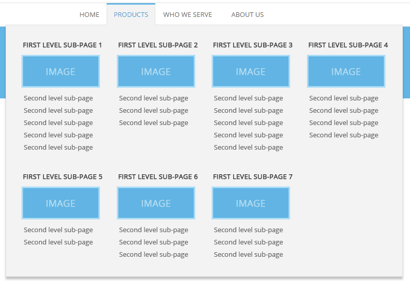
Mega menu structure we are aiming for:
This mega menu requires no plugins and no edits to the WP menu Walker. Just some admin work and CSS.
Scope:
- You coded a WordPress theme, the navigation menu is already in place and is responsive.
- Several menu items have drop down menus with one level of sub-pages.
- Now you want to add a mega menu to SOME of the menu items, that have more than one level of sub-pages.
- Sub-pages will be displayed in columns. First level sub-page will be a column title, and its children will be the links in a column.
- You also want a possibility to add images under each column title.
- All columns should have equal width.
- Columns’ content can be shorter or taller, but the columns will still have the same height. They won’t break the layout.
- Columns should automatically wrap on a second row if a certain number of columns per row is reached.
Sounds impossible? It’s actually quite easy.
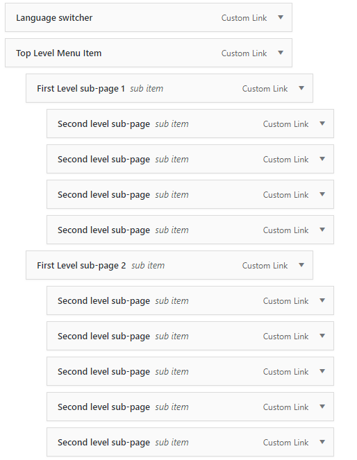
Step 1. Set up page structure in WordPress admin.
- Go to Admin -> Appearance -> Menus.
- Select the menu you want to add a mega menu to.
- Insert all the first and second level sub-pages.
- Then drag them under the top-level menu item that will have the mega menu, and indent:
- indent first level sub-pages once and second level sub-pages twice.
- Save the menu.
You should have something like the image below. Add as many sub-items as you need. We have used custom links, but you would normally use actual pages or posts, or combination of pages, posts, categories, etc.
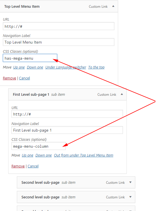
Step 2. Add CSS classes to the menu items in admin.
On the menu structure you created, uncollapse the top level menu item and insert class has-mega-menu into the CSS Classes (optional) field.
If you don’t see the CSS Classes (optional) field, click Screen Options tab at the top right of the screen and check CSS Classes checkbox.
Now, insert class mega-menu-column into each of the first level sub-pages CSS Classes (optional) field.
Step 3. Adding CSS code to the theme.
Here we will discuss only the CSS that will give the mega menu its structure. Styling actual links is your responsibility, since every theme is different.
Add the CSS to the main theme CSS file.
CSS for the top level menu item
@media screen and (min-width: 600px){ .has-mega-menu{ position:static; } li.has-mega-menu .sub-menu { width: 100%; position: absolute; top: NNpx; /*insert the needed value*/ z-index: 100; left:0px; right:0px; } li.has-mega-menu:hover>.sub-menu{ /*flexbox fallback for browsers that do not support CSS GRID lyout*/ display: flex; flex-wrap: wrap; /*CSS GRID lyout*/ display: grid; grid-template-columns: repeat(auto-fit,minmax(50%, 1fr)); } } @media screen and (min-width: 992px){ li.has-mega-menu:hover>.sub-menu{grid-template-columns: repeat(auto-fit,minmax(33.3333%, 1fr)); } } @media screen and (min-width: 1200px){ li.has-mega-menu:hover>.sub-menu{grid-template-columns: repeat(auto-fit,minmax(25%, 1fr)); } }
As you see we are starting to display the mega menu for screens that are at least 600px wide. There’s no use to display it for smaller screens. Use your default mobile styling for screens <600px. We are also displaying mega menu on mouse over. If your theme displays sub-menus onClick, adjust the code accordingly.
It’s important to give position:static; to the top level menu item. This way, the absolutely positioned .sub-menu will span 100% of the width of the first ancestor container that has position:relative; . So make sure you give position:relative to the site header or any other container that suits you. If top level menu would have had position:relative; then the mega menu would be only as wide as the top level menu item.
This line grid-template-columns: repeat(auto-fit,minmax(50%, 1fr)); tells .sub-menu (default WP sub-navigation class) that all its immediate children will be displayed as 2 columns of equal width on screens over 600px wide, as 3 columns of equal width on screens over 992px wide, etc. You can edit the break points to suit your needs.
We are also using Flexbox layout as a fallback for browsers that do not support CSS GRID lyout.
CSS for the first level sub-pages
@media screen and (min-width: 600px){ li.mega-menu-column { width: 100%; max-width: 100%; min-height: 1px; padding: 10px 25px; flex: 1 0 calc(50%); } } @media screen and (min-width: 992px){ li.mega-menu-column {flex: 1 0 calc(33.333%);} } @media screen and (min-width: 1200px){ li.mega-menu-column {flex: 1 0 calc(25%);} }
As you see, here we are just the CSS for the Flexbox fallback. Browsers that do support CSS GRID will simply ignore this code.
And that is all! You will, of course, style the first and second level links as you wish.
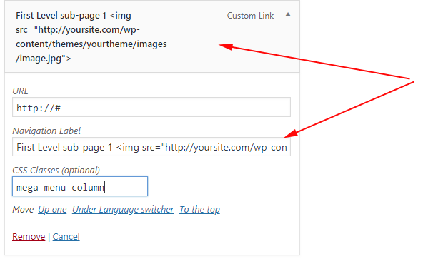
Adding images.
Adding images is also quite simple. Go back to Admin -> Appearance -> Menus. And add HTML code for an image to each of your First Level sub-pages. The image should be either uploaded to WP media library or FTP-ed to the server. In any case, something like this:
&lt;img src="http://yoursite.com/wp-content/themes/yourtheme/images/image.jpg"&gt;
You may want to add this CSS to the theme CSS file to make sure images sit on their own row, instead of floating next to the link:
.mega-menu-column img { display: block; }

