Making Images Retina Display Friendly
Have you ever noticed images look a bit blurry on your high res screen? Sometimes this is referred to as a "Retina" display... Its probably because the image used is exactly the pixels made for a regular display. If you want to show a higher quality image you have to double the pixels and then specify half, so then when a high res display picks up the image it will use the full size of the image rather than stretching it out and causing pixelation.
So to make your images look nice on a retina display, you need to double the image size and half the display size. That's if your not using a Scalable SVG image anyway (which always looks smooth). So this should only apply to PNG, GIF, or JPG and probably other types of pixel based images.
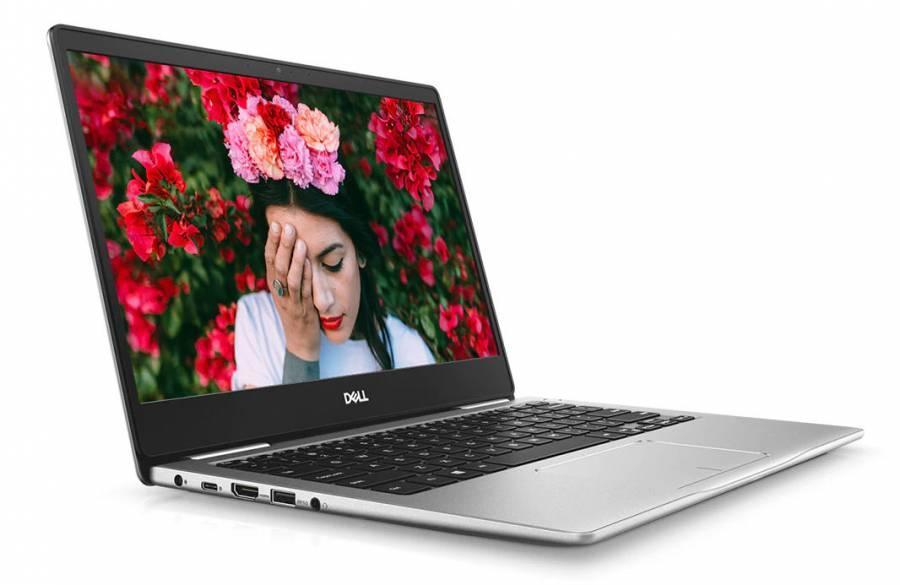
the original res of this image is 900 x 585 so we will set this to half, and when it displays it will look non pixelated
Using the max width and max height also allows this image to be responsive.
HTML
<img class='retina-friendly-image' src='https://kruxor.com/images/inspiron-13-7370-2.jpg'>CSS
.retina-friendly-image {
max-width:450px;
max-height:292px;
}


