Posted in designs
2530
6:12 am, July 6, 2021
 

im noticing a definite colour scheme in the landing page department

just having a search for this "landing page designs figma" as i thought figma designs are pretty nice looking

and its all shades of blue and purple it seems, must be popular..

this didnt actually help me in finding a decent looking landing page, you just click the links and get some advertisement for a figma page, and then it goes no where. Pff..

i was just looking for a simple landing page and it comes up with this:

how is that a landing page, its so specific and filled with stuff! its a full website not a landing page. 

i was thinking more along the lines of logo and then a background image and thats about it.

lets have a look at the colour pallet here
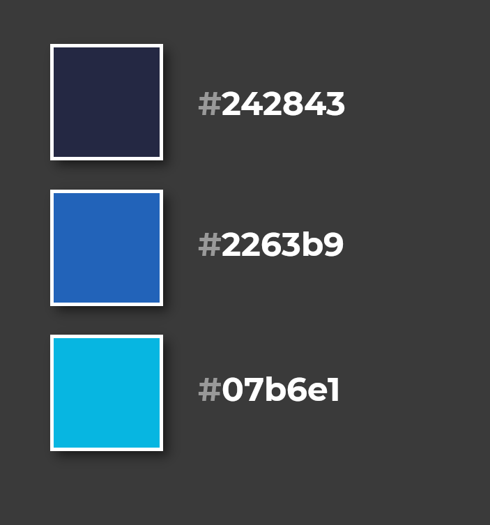
Here is my 1st go at a quick landing page... im not good at screen recording yet, just testing! ;)

Yes i realise i added all the colours and then only used white. 

View Statistics
This Week
94
This Month
357
This Year
826

No Items Found.

Add Comment
Type in a Nick Name here
 
Search Articles
Search Articles by entering your search text above.
Welcome

This is my test area for webdev. I keep a collection of code here, mostly for my reference. Also if i find a good link, i usually add it here and then forget about it. more...

Subscribe to weekly updates about things i have added to the site or thought interesting during the last week.

You could also follow me on twitter or not... does anyone even use twitter anymore?

If you found something useful or like my work, you can buy me a coffee here. Mmm Coffee. ☕

❤️👩‍💻🎮

🪦 2000 - 16 Oct 2022 - Boots
Random Quote
Old programmers never die; they just lose some of their functions.
Random CSS Property

padding-block

The padding-block CSS shorthand property defines the logical block start and end padding of an element, which maps to physical padding properties depending on the element's writing mode, directionality, and text orientation.
padding-block css reference