Posted in webdev
436
11:33 pm, January 24, 2019
 

Extending a background image using free transform Photoshop CS5

this method works better usually on more abstract images, but is a good way to fill in space. If you are trying to get a header or banner image to fit. 

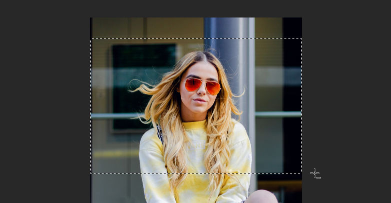
Lets say you have this image and want to stretch the background to fit a horizontal page banner.

Crop the section that you want to use

Copy this bit into a new image that is the width of the banner that you are creating, in this case i will use 1200px.

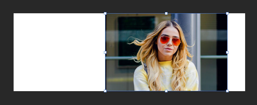
Select 1px width and full height on the left side of the image and copy and paste this into a new layer. 

Press Ctrl + T or access the free transform, when this layer is selected and hold down shift while dragging the selection to cover the white space. 

Now repeat this for the other side of the image.

Now we can export this image as a banner ready for use. Here is the final result. 

Sources

https://unsplash.com/photos/CPytUjxWmzA 

View Statistics
This Week
78
This Month
256
This Year
1350

No Items Found.

Add Comment
Type in a Nick Name here
 
Search Articles
Search Articles by entering your search text above.
Welcome

This is my test area for webdev. I keep a collection of code here, mostly for my reference. Also if i find a good link, i usually add it here and then forget about it. more...

You could also follow me on twitter. I have a couple of youtube channels if you want to see some video related content. RuneScape 3, Minecraft and also a coding channel here Web Dev.

If you found something useful or like my work, you can buy me a coffee here. Mmm Coffee. ☕

❤️👩‍💻🎮

🪦 2000 - 16 Oct 2022 - Boots
Random Quote
For a long time it had seemed to me that life was about to begin - real life. But there was always some obstacle in the way, something to be gotten through first, some unfinished business, time still to be served, or a debt to be paid. Then life would begin. At last it dawned on me that these obstacles were my life.
Alfred D. Souza
Random CSS Property

max-block-size

The max-block-size CSS property specifies the maximum size of an element in the direction opposite that of the writing direction as specified by writing-mode. That is, if the writing direction is horizontal, then max-block-size is equivalent to max-height; if the writing direction is vertical, max-block-size is the same as max-width.
max-block-size css reference